John Van Hamersveld’s pop culture expedition began over 50 years ago with the landmark Endless Summer movie poster. 300 album covers followed, including designs for the Beatles’ American pressing of Magical Mystery Tour, Exile On Main Street, the Rolling Stones portrait of confinement and escape, Jefferson Airplane’s self-empowering Crown of Creation, Grateful Dead’s discovered Skeletons in the Closet, Blondie’s inviting Eat to the Beat, and Hotter Than Hell from KISS.
Van Hamersveld created the LP graphics for Bob Dylan’s soundtrack to the movie Pat Garrett & Billy the Kid. John also crafted the cover art for The West Coast Pop Art Experimental Band LP. While helming the art department at Capitol Records from 1965-1968, John did the Beach Boys’ Wild Honey LP cover along with 54 album packages for the label during his tenure at the famed tower building in Hollywood.
In addition, Van Hamersveld collaborated with illustrator Rick Griffin for the Max Buda and Chris Darrow Eye of the Storm pairing, and then the graphics for This Is What You Want from John Lydon’s PIL.
John’s memorable 1968 Pinnacle Dance concert posters held at the Shrine Exposition Hall in downtown Los Angeles had a monumental influence on pop culture designs for generations to come, including artist Shepard Fairey
Van Hamersveld’s art can be found in The Smithsonian, The Los Angeles County Museum of Art, The Museum of Modern Art, Experience Music Project, and the Rock and Roll Hall of Fame.
John Van Hamersveld, Coolhous Studio, 50 years of Graphic Design was published by Ginkgo Press as a 304-page coffee table book. It is both a stunning and inspiring collection of text, assorted photos and illustrations. John’s West Coast-defined life and visionary process is fully housed and revealed in this gorgeous volume. Artist Shepard Fairey penned the introduction. gingkopress.com/03-gra/van-hamersveld.html.
Now screening in select cinema venues for 2021 is the film documentary, Crazy World Ain’t It. The Life and Times of John Van Hamersveld directed by Christopher Sibley. It had a world premiere at the Santa Barbara International Film Festival. As an interview subject for the film, I discussed Van Hamersveld’s engrossing art along with Shepard Fairey, world surf champion Shaun Thompson, Jeff Ho of the Zephyr Surf Team, designer Louise Sandhaus, Jim Fitzpatrick, Steve Olson, Gary Wong, Carole Caroompas, Chaz Bojorquez, and Quentin “Shplinton” Thomas.
Born at the John Hopkins University Hospital, Baltimore, MD, in 1941 and immediately raised in the South Bay section of Southern California, Van Hamersveld is a graduate of Art Center College of Design and Chouinard/California Institute of the Arts.
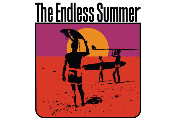
John’s epic poster of The Endless Summer might be considered his masterpiece. In 1966 a reproduction of the image ensured that the soundtrack album to Bruce Brown’s documentary movie took its rightful place as one of the best surf instrumental records and soundtracks of all-time. In 1964, the Sandals were known as The Sandells who released an obscure surf music LP called Scrambler! Then they encountered surfing documentary director Brown, who had the idea of following surfers around the globe chasing the perfect wave. Brown and co-producer Robert Bagley utilized music and theme cues culled from their album mixed with his spectacular footage. The irresistible combination proved instrumental in spreading surf culture worldwide, The Sandells re-named themselves the Sandals, and also re-named their album The Endless Summer.
 The Real Gone record label this summer has re-released The Endless Summer “ultraviolet” vinyl with the original artwork. It is the first-ever domestic reissue.
Track Listings
Side One
1. Scrambler
2. 6-Pac
3. Drifting
4. Theme from Endless Summer
5. Good Greeves
6. Decoy
Side Two
1. Out Front
2. Wild as the Sea
3. Trailing
4. Jet Black
5. Lonely Road
6. TR-6
And just how influential was Van Hamersveld’s Endless Summer artwork and Brown’s movie of the same name on surfing, skateboarding, the growth of volleyball, beach fashion, and particularly outdoor music festival culture?
In 2007 I interviewed Oscar-winning filmmaker D.A. Pennebaker. His documentaries include the acclaimed Don’t Look Back and Monterey Pop.
“I got a phone call from the Monterey International Pop Festival production office in Hollywood from [The Monkees] Bob Rafelson,” Pennebaker told me. “Bob said, ‘would you like to do a film of a concert in California?’ And I thought about it and I had just seen Bruce Brown’s Endless Summer, which is not about surfing at all, but all about California. Every kid out of high school the one thing they wanted to do was get to California, and Endless Summer didn’t hurt. Lou Adler, John Phillips and I flew up with Cass Elliot to see Monterey. I had never seen a music festival, not even Newport, so I didn’t know what to expect. I loved Monterey. I later saw what happened at Woodstock in 1969, and I really didn’t want to get involved with that at all. One of the producers of Woodstock saw Monterey Pop and wanted to do a festival.”
During the last decade John Van Hamersveld and I conducted interviews and email communications from his Palos Verdes, Ca.-based studio.
Q: Water and the beach have always been ongoing factors in your life.
A: I moved from my parents' eastern establishment at nine years old to grow up as a surfer in Southern California chasing surfers and waves from 1953 to 1960. At 19 years old, I quit surfing and moved to Art Center College on 3rd Street in Los Angeles for art school in 1961-1962 to study art and design there.
As the end of the spring semester unfolded into a job my father created at Northrop Aviation working in the publication department. That summer I invented a surfing magazine called Surfing Illustrated, and later ended up working as an art director of Surfer magazine in the new surf industry, and created The Endless Summer Poster, and the Clark Foam trademark for new foam surfboards.
I came to a realization that I had left a surfing career for the urban art scene in 1965. The Endless Summer Poster was becoming a hit in New York City and distributed around the world. I had forged a career out of art school and the art and entertainment business. It seemed that everything I dealt with was my same age, was my generation, so everyone could relate to one another.
I grew up in Southern California as a surfer; there were three of us and we traveled everywhere to surf and meet other surf gangs in the 50s. It is ironic that the threesome has become symbolic as the image of surfing. What (director and producer) Bruce Brown did to capture that idea and stretch the concept around the world and to make a statement like that is his genius. Playing out in the travel film for tourist with surfboards.
The poster came from when I was an art student in art school, made in the small town of Dana Point. I was the art director. Bruce stood in as the foreground figure in the photo with the board over his head with Mike Hynson and Robert August. The film and the poster went to New York City and made a killing. It had a reputation with ‘60s pop culture then and today. I, as the designer, have followed the poster and the distribution of the variations over decades. I showed it at Art Center College of Design where the poster was done in connection with my education there in 1961-1964. The Design Faculty still view it as fresh and new today. The poster is collected by MOMA, in New York City. The poster and the film continue to tell a story about surfing but also symbolically represent surf culture today.
I started with The Endless Summer poster in 1963 as a graphic design student, later being reconstructed for a Sandals soundtrack for Bruce Brown’s The Endless Summer movie album created by World Pacific in 1966.
I was recommended by my instructor friend and Ed Ruscha at a lunch one day who suggested I could call Capitol Records and meet a director in Art Services. I was 25 years old and without a job. I had an art school portfolio from Chouinard Art Institute/Cal Arts, there was some Surfer magazines from the early jobs at Surfer and the new Day-Glo Endless Summer Poster.
I made the call to the Capitol Art Department and they answered and gave me an appointment. I had used my Chouinard instructor friend's name as a reference.
Later I went for an interview at Capitol Records and showed the poster to George Osaki of creative services at the Capitol Records building, on the 6th floor in 1967. He recommended me to Brown Meggs who was the vice president of the CRDC, the Capitol Records Distribution Company.
The first meeting at the circular Capitol Building that looked like a stack of records. Up the elevator I went and I stepped out on to the 6th floor art department, went to the left and sat in a waiting chair in Art Department room. I lit up a Kent cigarette while I waited. I take a puff, while suddenly the secretary welcomed me to come into what is George Osaki's white office with a desk and book case, the cigarette in burning with an ash on the end. I have walked into the appointment and the ash is longer. I sat down in another chair in front of desk I chatted and showed my work of commercial images I had done for other corporations.
Then the moment came where I had to stand up to show the 40x30 Endless Summer Poster in his small executive office. George looked and reached over to his white Italia book case and pulled a 12x12 Endless Summer album cover by World Pacific Records as he showed to me. It was quite a moment where the poster became an album cover, as I looked down the ash from the cigarette drop to the floor. Even though I interested him as a person for the job, I still wonder if he knew I had burned his carpet. As I left George said he would call me in three weeks.
I had rented the Coronado Studio near Otis Art Institute where my girlfriend was a student. The Los Angeles smog that fall and spring was tough. Downtown was a long ways from the beach I knew.
Q: Then what happened?
A: Capitol Records called after three weeks while I had to stick around the studio to get the call. No cellphone then. George as the director of the Art Services asked me to report to the 8th floor of the Capitol Record building on Vine Street. As I step stepped off the 8th floor from the elevator I then turned left and walk into Brown Meggs office. Meggs appeared in front of me and addressed me quickly saying. ‘You are going to take this job and you can't turn the job down.’ I paused for the moment. It was curiosity about this news with the corporate aggressiveness behind his manor. I looked into his pale smooth face sitting on that white collar and tie with the corporate blue suit uniform. I was wearing my art school outfit with an art studio as an art student from the underground. Here was in the air-conditioning of the executive offices. With this air flowing it was a new status for me to do work here and get paid.
The back story to Brown Meggs relationship was a reality that he had seen visually introduced of Endless Summer campaign to the New York market while he was there at the New York office of Capitol Records, a Yale graduate, he had seen the poster published and distributed there. I was lucky I had come from the eastern seaboard with my parents who raised me in their tradition up bring. So I still had the benefit of the easterner vibe while being from the surf scene and the art school scene, also the art scene where the underground culture was happening in the new fashion of the media generation of free press and new bands.
Q: In spring 1966, my pal Peter Piper and I attended one of the first screenings of The Endless Summer at the Encore Theater on Melrose Ave. in Hollywood. Peter is a long boarder. We met Bruce Brown and later saw the movie a few times at The Santa Monica Civic Auditorium. People were ecstatic. Surfers and skateboarders were hurling bottle caps at the big screen. Surfing has grown over a half a century. What was surfing and what has the sport become? Your Endless Summer design and the revolutionary Bruce Brown movie has always been a constant organic marketing message.
A: Surfing was almost free where your mother paid for the Paraffin wax that was 25 cents, is now $5.95. And the surfboard that was $75 dollars then. Now is $375 to $750. Now you have to have a couple thousand dollars for the board, the rubber suit, someone's car, lunch, money for gas and for parking lot, and be patient for all the surfers in the water around that want the same wave, somebody to pay the doctor bill for when you get sick from the ocean waters while surfing.
Q: Your designed image is worldwide.
A: It's not that I see the poster in places. It is the streams of people over the decades that tell me of their sister, daughter, aunt, uncle, father having had the poster in their college dorm room.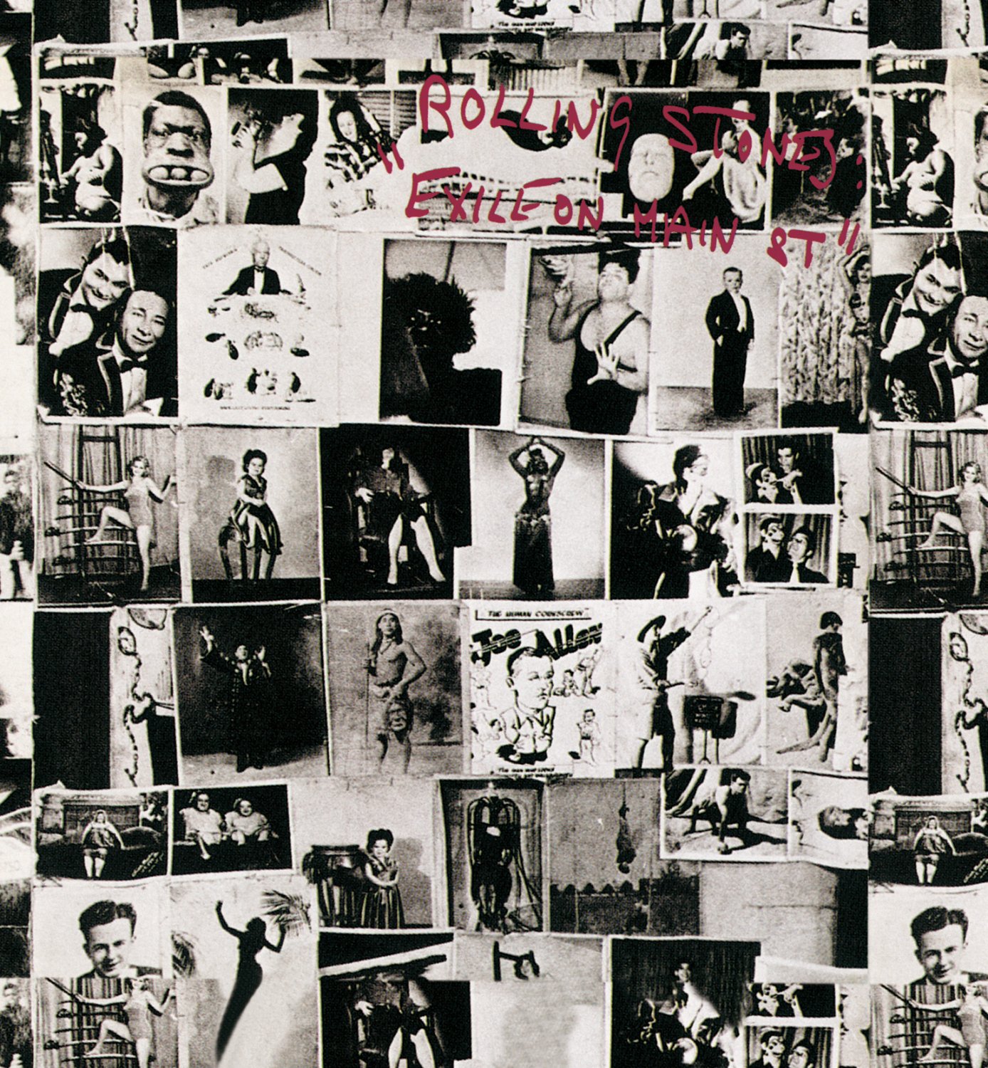
Q: The Rolling Stones in 2022 will tout the 50th retail anniversary of their Exile On Main Street double album. You designed the artwork. How did it happen? Guide me into the process of creating those visuals. I saw five 1972 concerts by the Stones in Southern California.
A: Most people don't understand the politics behind the development of album cover of the past. First of all, the album was like buying a piece pop culture fashion, constructed by a graphic designer reflecting the music culture. Like Sgt. Pepper’s Lonely Hearts Band, or Andy Warhol's Banana for the Velvet Underground, or Pink Floyd's Dark Side of the Moon. Then came the Exile on Main Street cover from the Stones in 1972 that turned heads.
One day (photographer) Norman Seef and I met the Rolling Stones in Hollywood. A beautiful girlfriend I had met earlier on ‘the scene’ in London, Chris O’Dell, was now Mick Jagger’s personal assistant. And so in early 1972, the Rolling Stones approached Norman and me to work on the design of a songbook with photographs for Warner Brothers. At this stage, I didn’t know that I would be packaging Exile on Main Street. The Stones were in Los Angeles at Sunset Sound studios, finishing the record. Our first meeting was set to be in Bel Air, where they were staying.
Perhaps the most memorable photograph on the cover is one of a guy holding three balls in his mouth. Marshall Chess, who was then the Stones’ manager, needed an image for billboards and other advertising; I had a great idea. ‘Look-it,’ he said, ‘Why don’t we take the guy with the balls in his mouth. That is the most amazing photograph I’ve ever seen. And doesn’t it look like Charlie?’
Keith was sitting on the couch across from me. He was looking at me in his mirrored sunglasses while smoking a joint. He looked so healthy, handsome, and rested. Then, to my surprise, Robert Frank (the photographer and film-maker well known for his late 1950s book The Americans, with a foreword by Jack Kerouac) walked into the room with a small Super 8mm Canon camera. Jagger and I smiled. ‘This is a very hip day,’ I said to myself.
I knew Robert from a meeting in New York in 1968. I knew of Frank, and said to Jagger, ‘Hey, why not use Frank for the album cover?’ This then was when the concept was launched in Jagger’s mind. Frank and Jagger had a conversation and later went off to seedy Main Street in Los Angeles to take photographs of the band, and this was when the Stones in ‘Exile’ and ‘Main Street’ came together as a product title.
At the request of Marshall Chess, Norman and I came to a second day of meetings. We walked through the living room of the villa, down to the far wall in the dining room where Mick and Keith were waiting with Marshall. Marshall started the meeting, and Norman handed another album cover by another designer to him. The cover was passed to Jagger for approval. He rejected it. Marshall then handed me a Robert Frank front photo collage. The tattoo-parlor-wall cover image was from Robert’s photo documentary The Americans. Mick, on my right, looked on for both of us to agree, so I nod. This then became the famous photo-composition for the Exile on Main Street album cover. As the meeting progressed, the other pieces of the package were handed to me.
During the meeting, Marshall asked me what we would do with Norman’s photos, given that Frank’s photos were the agreed-upon ones for the cover. Marshall had Norman’s images from the late-night photo shoot. They were the sequences in which Keith arrived at the very last minute for the shoot. Everyone had been waiting for him to show, and then he arrived with his pants hanging off his butt. With Keith’s arrival, the group was ready to go on with Norman’s session (‘This is a one-time shot!’ someone said). Lights, smoke, and confetti were readied, and a sequence was attempted, but then, by accident, Keith began to fall all over the set, creating a disaster. All else failed, and our budget then had been used up.
Suddenly Keith said from across the edge of the table, ‘Make some postcards,’ showing us with his hands an accordion-folded-style collection of postcards. He then proceeded to almost lose his balance and fall over onto the rug. I said to Mick, ‘Let’s take that as an idea and do it.’ He agreed and Marshall said, ‘Done.’ Marshall and Jagger handed me a stack of photos made by Frank over the weekend. I left with the visual ingredients to go to my place at the Chapman Park Studio Building.
The last step of the approval process stopped at Ahmet Ertegun’s office at Atlantic Records. He was the label’s ultimate authority and so when this kind of art and aesthetic made it past his eyes I knew that all would be OK. In the eyes of many in the industry, they were all shocked by the ugly, rough, tuff, beat look of the package and that it was not funny or real humorous (to anyone but a Johnny Rotten).
So, as the result of Jagger and I sitting side by side in 1972 at our meeting, my arrangement of materials that would go beyond Frank’s photo style, creating an identity that would become the basis of the punk fashion movement.
Q: There was a huge billboard in Hollywood of your Stones’ Exile imagery on Sunset Blvd.
A: One day, Norman and I drove through Hollywood in his dark green ’69 Mustang convertible with the top down. I had a stat of the cover in my hand, and we looked it over as an art piece. I told him I thought if I were to take four of the front cover photos out and paste them in color into the billboard composition, I would have a great design. So I later blew up the photos and pasted them on a board. The next day I had to get the right measurements for the size of the hand-painted outdoor billboards. I went over to Pacific Outdoor to meet a couple of salesmen to show me a diagram of the billboard on the Sunset Strip. There in the office we agreed, and went over the government codes and restrictions for the scale requirements. I helped them maximize the size to be larger than normal. The finished product finally was placed at Sunset and La Cienega, at the top of the hill. I focused the message around the fantasy, sideshow characters in the cover with the guy with eggs in his mouth.
This became the ‘freaks’ displayed on the Sunset Strip, a prestigious site for the ‘Art & rock Scene.’ Reviewers said that the cover shot, assorted pictures of circus freaks, is not a collage but a photo Frank took in 1950 of the wall of a tattoo parlor somewhere on Route 66. The comparison to the notorious Stones – jet-setting tax exiles, cocaine-fueled satyrs and perpetual outsiders – is clear. To drive the point home, an identical layout on the back cover featured Frank’s photos of the Stones themselves, shot on LA’s seedy Main Street. (Frank did a 1972 tour film documentary of the Rolling Stones, the unreleased Cocksucker Blues)
The inner sleeves were even more casually slapped together, with titles and credits hand-lettered by Jagger himself. The layout perfectly complements the sprawling, ramshackle sound of Exile itself.
Q: History has shown how influential your graphic style was then.
A: To the spectators, critics, and others in the establishment, I had made a package that was not glamorous. It was not a friendly image to put on display in the record stores, but it was that image that established the anti-establishment look of punk. It took years to recover from the cover’s graphic statement, with new generations of punks exploiting the graphic concept to this day - still ripping and tearing and drawing all over things with their own graffiti.
The album cover art images from the past, as part of our culture, were styled for fashion and archetype.
In 1984, my friend John Lydon said to me, ‘The Stones’ Exile package set the image of punk in 1975 - we used that graphic feel to communicate our message graphically.’ At least Johnny was nice enough to explain what his intention was then…
In the 70's, I do feel that 12x12 album covers were an all-inclusive image of cultural style in the visual fashion of the sixties and the seventies. I was, therefore, a well-known designer of cultural images which were created as reflections of that culture. These were then watched closely by other design teams and designers who copied me their pursuit to find new images. Today more than 100,000 artists are using a ‘Ripping and Tearing’ style and graffiti in their work.
Information: JVH.cool/new
Harvey Kubernik is the author of 20 books, including Canyon Of Dreams: The Magic And The Music Of Laurel Canyon and Turn Up The Radio! Rock, Pop and Roll In Los Angeles 1956-1972. Sterling/Barnes and Noble in 2018 published Harvey and Kenneth Kubernik’s The Story Of The Band: From Big Pink To The Last Waltz. For summer 2021 the duo has written a multi-narrative volume on Jimi Hendrix for the publisher.
Otherworld Cottage Industries in 2020 published Harvey’s book, Docs That Rock, Music That Matters, featuring interviews with D.A. Pennebaker, Chris Hegedus, Albert Maysles, Murray Lerner, Morgan Neville, Dr. James Cushing, Curtis Hanson, Michael Lindsay-Hogg, Andrew Loog Oldham, Dick Clark, Ray Manzarek, John Densmore, Robby Krieger, Travis Pike, Allan Arkush, and David Leaf, among others.
In 2020 Harvey served as Consultant on Laurel Canyon: A Place In Time documentary directed by Alison Ellwood which debuted in 2020 on the EPIX/MGM television channel.
Kubernik’s writings are in several book anthologies, most notably The Rolling Stone Book Of The Beats and Drinking With Bukowski. Harvey penned a back cover endorsement for author Michael Posner’s book on Leonard Cohen that Simon & Schuster, Canada published in October 2020, Leonard Cohen, Untold Stories: The Early Years)
Harvey Kubernik’s 1995 interview, Berry Gordy: A Conversation With Mr. Motown is included in The Pop, Rock & Soul Reader edited by David Brackett published in 2019 by Oxford University Press.
This century Harvey penned the liner note booklets to the CD re-releases of Carole King’s Tapestry, Allen Ginsberg’s Kaddish, Elvis Presley The ’68 Comeback Special and The Ramones’ End of the Century.
For the upcoming National Record Store Day Drops, November 17, 2021, record producer/entrepreneur and Rock and Roll Hall of Fame member Lou Adler commissioned Harvey Kubernik to write the 1,500 word liner notes for the complete Big Brothers & the Holding Company June 1967 live sets at the Monterey International Pop Festival. The band, featuring lead singer Janis Joplin, performed two days at the legendary event, and for the first time this vinyl-only item contains the never before heard second day audio from the original 8-track tapes produced by Adler.
Harvey Kubernik was filmed for the in-progress music documentary about the former Hollywood landmark Gold Star Recording Studio and co-owner/engineer Stan Ross, produced and directed by Jonathan Rosenberg and Brad Ross. Brian Wilson, Herb Alpert, Richie Furay, Mike Curb, Chris Montez, Nino Tempo, Bill Medley, Don Randi, Hal Blaine, Don Peake, Shel Talmy, Carol Kaye, Kim Fowley, Darlene Love, Marky Ramone, Gloria Jones, Perry Botkin, Jr., Artie Butler, David Kessel and Steven Van Zandt were among those participating.