The CMAY Gallery is pleased to present Beyond the Wave, October 10-November 25, 2026, an exhibition examining legendary visual artist John Van Hamersveld’s transformation of the wave from recognizable image into abstraction.
The CMAY Gallery is located at 5828 Wilshire Boulevard in Los Angeles.
For more than six decades, Van Hamersveld has occupied a distinctive position within the visual culture of Southern California, moving between fine art, graphic design, music, album covers, surfing, printmaking, and public imagery.
John Van Hamersveld’s artistic journey began with the Endless Summer movie poster. Then more than 300 album covers, including designs for the Beatles’ American pressing of Magical Mystery Tour, Exile On Main St, the Rolling Stones portrait of confinement and escape, the Jefferson Airplane’s self-empowering Crown of Creation, Grateful Dead’s discovered Skeletons in the Closet, Blondie’s inviting Eat to the Beat, the sizzling Hotter Than Hell KISS product, and the sexual and religious expedition of An American Prayer, poetry from Jim Morrison, music by the Doors.
Van Hamersveld created the artwork for Bob Dylan’s soundtrack to Pat Garrett & Billy the Kid. He also designed the cover art for The West Coast Pop Art Experimental Band.
While helming the art department at Capitol Records from 1965-1968, he did the Beach Boys’ Wild Honey LP cover along with 54 album packages for the label. Van Hamersveld collaborated with illustrator Rick Griffin for the Max Buda and Chris Darrow Eye of the Storm, and later did the graphics for This Is What You Want from John Lyden’s PIL.
John’s art can be found in The Smithsonian, The Los Angeles County Museum of Art, The Museum of Modern Art, Experience Music Project, and the Rock and Roll Hall of Fame. Visit John Van Hamersveld’s website: www.post-future.com
Van Hamersveld was both a participant in and a contributor to this cultural transformation. The Southern California culture of which he was a part would become internationally influential through surfing, skateboarding, music, album graphic design, fashion, photography, and youth culture. More broadly, his work belongs to a Southern California visual tradition whose influence has extended far beyond the region itself.
On Saturday, May 22, 2027, at the Fullerton Museum Center, the venue will host a reception for their exhibition and cultural event, Locos X, 4:00-9:00 p.m. 301 N Pomona Ave. Fullerton, CA.
Locos X brings together the California Locos Collective—founded by Dave Tourjé—and celebrated artists Chaz Bojórquez, John Van Hamersveld, Norton Wisdom, and Gary Wong, whose work bridges fine art and popular culture.
Opening night features a performance by the Los Angeles punk band X, featuring original members—Exene Cervenka, John Doe, Billy Zoom, and D.J. Bonebrake.
Van Hamersveld’s short documentary film Crazy World Ain’t It offers viewers a vivid glimpse into John’s art career.
The award-winning documentary artfully demonstrates his influence on culture and on other renowned artists, and serves as a beacon of inspiration to all young artists, encouraging them to pursue their art.
The film was produced and directed by Dave Tourjé, award-winning director Christopher Sibley, and producer Arianna Capriotti, with the screenplay by Andrew Van Wyk and Adam Cude.
Born at the Johns Hopkins University Hospital, Baltimore, MD, in 1941 and immediately raised in the South Bay section of Southern California, John Van Hamersveld is a graduate of Art Center College of Design and Chouiard/California Institute of the Arts.
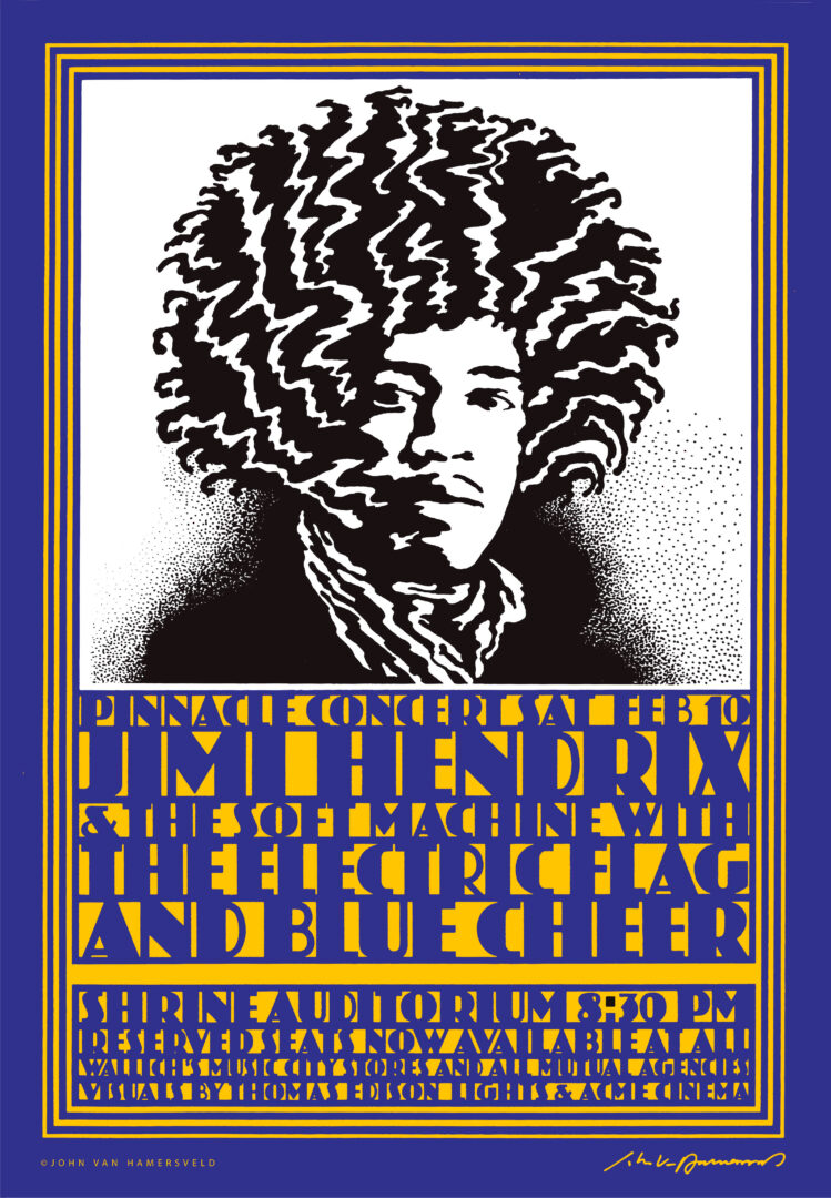
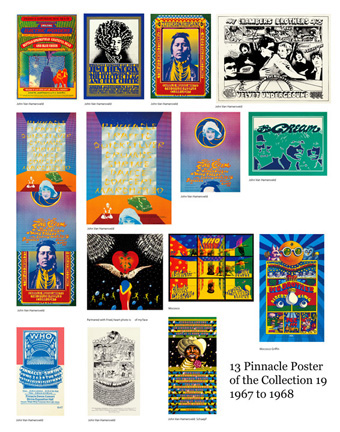
During late 1967 and through ’68, John was the co-promoter with Marc Chase and Sepp Donahower of the Pinnacle Dance Concerts in Los Angeles at the Shrine Exposition Hall. Van Hamersveld drew and designed the iconic event posters.
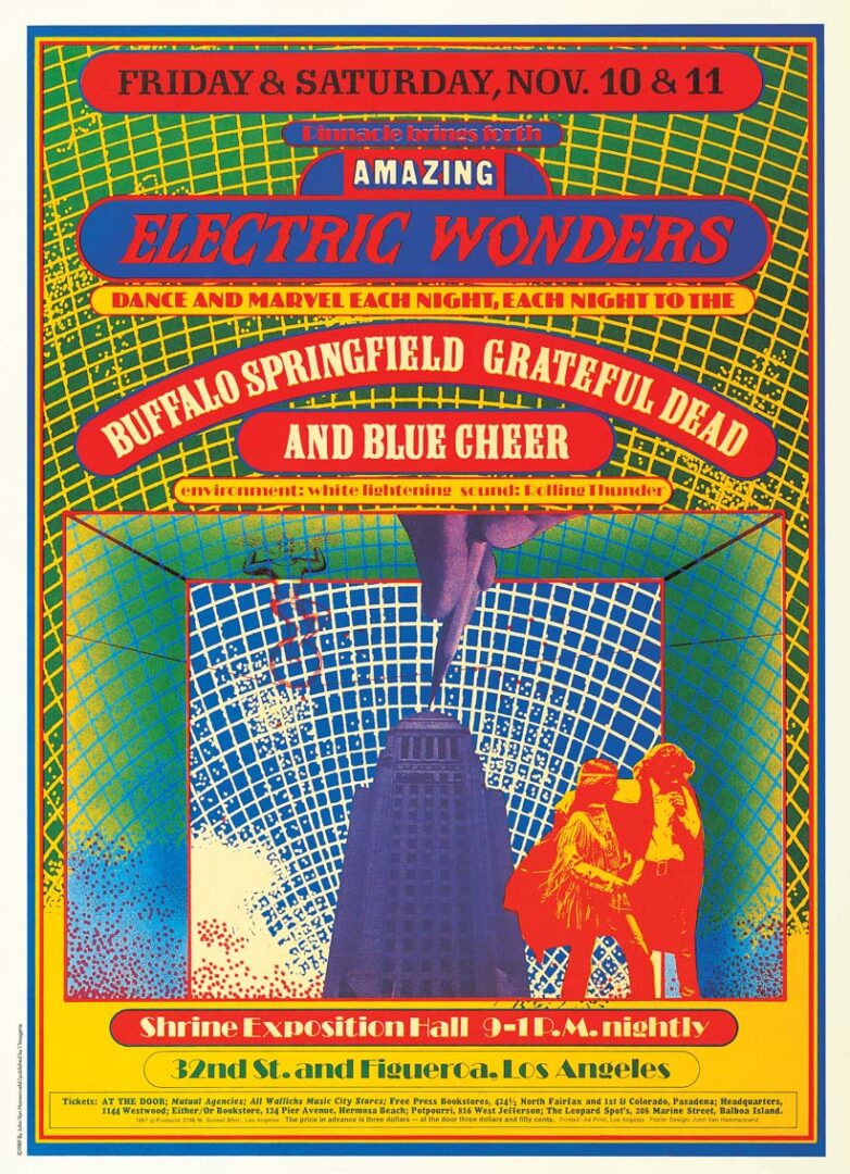
Van Hamersveld designed a definitive breakout poster for Pinnacle’s debut event on November 10–11, 1967, which featured a powerhouse lineup of Buffalo Springfield, the Grateful Dead, and Blue Cheer.
Departing from the fluid, melting style popularized by San Francisco artists, Van Hamersveld's design utilized high-contrast, vibrantly saturated neon inks and a bold graphic sensibility, establishing a distinctly Southern California pop-modernist aesthetic.
Pinnacle went on to produce 17 monumental shows at the Shrine between 1967 and 1968, effectively reshaping the cultural landscape of Los Angeles.
John’s Pinnacle posters created a monumental influence on pop culture artists for generations to come, including Shepard Fairey.
“John Van Hamersveld’s works for the Shrine posters were very subtle in his approach to color,” explained music poster and graphic artist Dennis Loren in a 2017 interview with me.
“His Shrine posters are overlooked, and that’s because the focus was on San Francisco, where the poster art sorta came into bloom there; but it doesn’t diminish the work of Gary Grimshaw in Detroit or John in L.A. Of all the psychedelic artists, John is the most minimalist.”
In 2012, I discussed two seminal Pinnacle posters that once graced the walls of my teenage bedroom.
Q: Drawing the Jimi Hendrix Shrine/Pinnacle concert poster. How did it start, and explain the construction of this image?
A: Making the classic rock poster: I knew I had to get the drawing done. There were a couple of starts, but on the morning of December 28, 1967, as I sat down at the drawing table inside my second- story Coronado Street Studio, I started a new kind of drawing for the poster.
The morning light came in through the large front window of the studio corner, casting the light across the table, spreading over the paper. With my black Pentel pen in hand, I began drawing from the image in my mind the portraiture of the head of Jimi Hendrix with wired hair, styled in his fashionable coiffure from London, like the Cream.
I put the drawing in a drawer for a week to think about it. My partners Sepp [Donahower] and Marc [Chase] had booked the Jimi Hendrix Experience for the Shrine Auditorium. The Single Wing Turquoise Bird did our multimedia might shows.
My drawing was incorporated into the design of a Shrine Auditorium event. The poster was distributed locally and then nationally and worldwide.
The Electric Flag was on the bill, and one of the band members was Buddy Miles.
I was at one of the rehearsals that week. Jimi Hendrix was staying in the town at the Harry Houdini Mansion in Laurel Canyon.
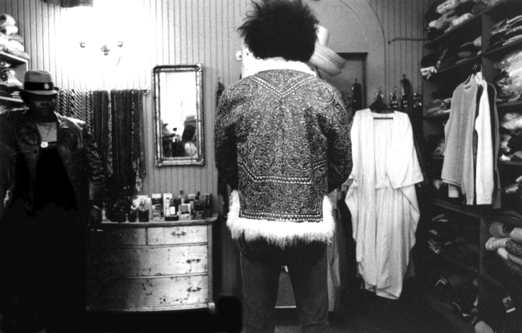
I was up on Sunset Boulevard at the De Voss Clothing Store where most in the rock scene like the Doors, Beatles, and the Stones bought suits, shirts, and shoes. I was in the hallway area of the store and ran into Jimi there, face to face... I asked as a conversational question... “How do you like L.A?” As the answer came back, “Confusing!”
I had my Leica camera with me. They veered off into the room to look at jackets. That is where Jimi is looking into the mirror and picks out an Afghan Jacket and puts it on. I am at the back of the room, and Buddy is staying behind him off to the side.
I imagine Jimi would always have people and photographers chasing him everyday. Buddy was big as if he were the side man, but maybe more often was like a bodyguard.
Q: Can you discuss the Jefferson Airplane Shrine Exposition Hall poster and cover of the LP Crown of Creation?
A: Paul Kantner and Grace Slick were the Jefferson Airplane. One night, they stopped by my house on Kingsley in Los Angeles. My studio was in the attic, where we relaxed on early American wooden chairs. We were together, so we got high. We used the drawing table to roll some of that great Mexican pot into joints. At the time all pot seemed to be great. “Man, you gotta check out this great pot.” We bonded through the ritual ceremony of lighting up and getting high. It was all a part of the cosmic psychedelic mind game. “I’m out there in space,” I told Paul and Grace, who looked at me with knowing smiles.
They gave me a lid to keep me going, while I worked on the design for their upcoming album. [Crown of Creation]. I placed the memory of this unbelievable evening in my precious suitcase of dreams.
The idea of creating this album cover sent me higher into a new orbit of ecstatic possibilities. I realized that I was part of the underground media in the new cultural revolution. At the age of 27, I was recognized as an independent creative director. far out!! from my third-floor aerie I looked out the window, daydreaming. I fantasized that I was in a movie: a plain-clothes policeman sat in an un-marked car and watched me while I puffed to the constant beat of the music. All day and all night, a
parade of friendly characters – groupies, designers, musicians, journalists, managers – dropped in to see me. I was there, stoned, speechless, drawing images.
The Jefferson Airplane, Pinnacle Indian Poster: 1967 was passing and 1968 loomed. In the new year, I was in the studio looking for an image for the band Jefferson Airplane. As I sat smoking my cigarettes and rolling some joints, I could not think of any one image for them as a band, so I chose to enter from a subliminal level. Their audience was always stoned, so anything I used could be read into as intentional.
I decided that I would think of the show as if it were a meeting of the Northern and Southern tribes of the new hippies, and out of the closet came the Indian photo. I puffed and puffed and focused my typography in a myopic process. It eventually emerged like a beaded belt design I saw once at a trading post in the Southwest. You could read it if you were stoned. And so, the 8” x 10” photo of an Indian is launched into the images of eternity. I positioned it in a new way.
Then came the community idea in August 1967, confusing without narrative, only abstract thoughts. I created the word for my happening ‘Pinnacle,’ meaning ‘High Places,’ as it came to mind as I awoke one morning. That moment created the Pinnacle posters to promote the large- scale shows at the Shrine Exposition Hall. The idea was bigger than the Elks Hall shows organized by Otis and Chouinard Art Schools for the students. The first show in November was great, but lost money. Our group managed to get some money together and book shows into May of 1968.
Q: The Beatles' Magical Mystery Tour will be celebrating a 60th anniversary in 2028. Can you reflect on the artwork on the American edition you did for Capitol Records, initially issued in EP format in the UK?
In 1987, EMI released Magical Mystery Tour as a full-length album in true stereo. This is the only example where an American configuration was the preference instead of the EMI version.
Talk to me about concepts, layout and stripping in lettering.
A: It all starts here with Brian Epstein gone from his role as manager of Beatles product. The boys are in photographs on all of the album covers, and the press and on the cover as usual is what the company agrees to sell at the rack jobber level, meaning the bins at the store where the buyer sees the product and identifies with it. The sampling of the music is on the radio, but photographs and film images of the band always reinforce sales. EMI supplied the cover to Capitol Records in the contract between the two companies.
I started with The Endless Summer Poster in 1963 as a graphic design student, later being reconstructed for a Sandals soundtrack for Bruce Brown’s The Endless Summer movie album created by World Pacific in 1966.
I was on my Summer Vacation from Chouinard Art Institute and needed to connect with a job. So, at the suggestion of my new teacher friend Pat Blackwell and the young artist Ed Ruscha, who were artists in the Ferus Gallery art scene. Pat Blackwell, Ed Ruscha, Joe Good and Jerry McMillin were the Oklahoma Boys who came to L.A. to be artists.
I was having a moment at lunch with Pat, Ed, and Joe talking about getting some illustration work I could do at my studio across town in art school neighborhood. Pat said he had been doing some freelance work with a George Osaki, head of Arts Services at Capitol Records in Hollywood. The idea went around in my head, Hollywood & Vine, was not in the art scene like the Las Cienega Boulevard world I had been working in then
At the meeting in Capitol Records office with my portfolio of surf magazines and new The Endless Summer Poster 40x30 day glow color silkscreen poster, it was distributed by Personality Posters in New York, and the poster immediately connected us with surfing and surfers, but me not really understanding at the moment the campaign poster was seen everywhere since 1966.
In the Capitol office, speaking with George, on the 6th floor of the Welton & Becket architecture inside of the circular late modern building, the Capitol building, that looked like a stack of records, quite a different moment from where I had been over the years as a surfer and artist.
When George saw The Endless Summer poster, he immediately reached over to his modern white pristine Italy design bookcase and picked out an Endless Summer Poster on the front of The Endless Summer soundtrack album. It was the moment I was assumed to have designed the album cover. At that point in the meeting, I became an album cover designer of popular culture packaging and promotion. I was not just an art student.
He had a slight Hawaiian pidgin accent and spoke quickly, as in a hurry to get the word out, and asked if I wanted a job and said he would call me for an appointment for a meeting in three weeks.
Back at the Coronado Studio, I waited for two weeks to get the call from George Osaki. On that day, there were no answers but for the rich corporate world. I was there in the studio when the call came in, and I had to organize myself to go to the appointment.
I drove over to Capitol and stood in the elevator while I was taken past the 6TH floor, where I met George on the executive floor on the 8th floor. There at the open door and went to the right and down a hall to an open door. As I was arriving to go into the room, there stood Brown Meggs, the vice president of CRDC, Capitol Record Distribution Company.
He was in his dark blue suit and thin tie, groomed to a T, a Yale graduate. I looked like the artist for Art School as he made contact with my eyes and said, ‘I am going to hire you, and you can't turn the job down!’
I am a little shocked by understanding the offer. So, I say ‘YES.’
The back story to my Brown Meggs relationship was a reality that he had seen The Endless Summer campaign in the New York market while at the New York office of Capitol Records. Meggs saw my poster displayed and distributed.
There were five art directors on the floor or the art department with secretaries. We were constantly busy with album cover campaigns. I was Brown Meg's personal art director in the art department. George had four designers working for him. One was Rod Dyer, Roy Kohara, Roland Young, and John Henley. They were always busy with album cover designs and campaign materials.
They would shoot photos of young models in fields and parks to make covers of Capitol’s oldest catalog of releases. The rack jobber who filled the bins at the store loved the look of females who had come from Nina Blanchard Agency, the top agency. Most of the models were young, just starting to get a break in their business. Some girls were on the staff at the office with a desk job.
But things were changing with the newer music acts, and record covers had come to a new level of manufacturing and supply and demand. Car tapes and cassettes became a product at the record store, so the 12x12 was now a promotional image.
The press was hopping with information of the young culture I was a part of. But at the end of the day, I had to go back to the studio and do my personal work as the artist I was trained to be. So, the conflict started. There was the Hollywood scene, and then there was the reality of producing my own art and keeping up with the art scene.
The senior executive of the art department was Marvin Schwartz, who was an Art Director of Angel and Capitol Records for 35 years. He would tell me to slow down. He and Brown Meggs were my bosses, who told me to... ‘Just make sure you are here every day.’
One day while in my office, Brown called me and said... ‘Come up to my office!’
We’re in his office face to face. The door is closed behind me. Brown tells me of Brian Epstein’s suicide, who managed the Beatles. This was August 1967.
“In 1963 Epstein played an advance pressing [on Parlophone] of ‘I Want to Hold Your Hand’ to Meggs [when he was director of east coast operations for Capitol], and they released and actively promoted it in the U.S. after the label passed on the group’s first few singles.
Brown reaches over to the desk for a small EP album cover, shows the cover to me, and says, ‘This is the Beatles’ new album we received from EMI.’ And adds, ‘How can I sell this to the stores? I am the Vice President of the CRDC. What do I do with this?’ John, you are my art director!’
We begin to sit down as I am thinking on my feet at this point; he sits down in his chair in the executive small office room on the corner of the building. He says, ‘The news on this Magical Mystery Tour video movie for the BBC is a flop! What do you think you can do to put this together with the tune titles to sell it to the consumer?’
I say, ‘Okay, I’ll take it home tonight and figure it out!’ So, I am sent home to do the work at my studio as a private contractor, separated from Capitol Records staff, or art department where my day job office is. I sit there in my studio the first night wondering how to solve the problem.
The difficulty of being an artist, and then having to work for Meggs as a graphic design/art director for him personally. He would have George give me freelance work to take home to my studio and bill them, using my girlfriend to cash the check so Capitol accounting would not know.
So, from Brown’s point of view, I was to bring the underground graphic look to the double EP that EMI in the U.K. had provided. The EP was customized and masked faces of the Beatles. The company had made all their sales on the Beatles’ portraits on the cover of their albums. This time they didn’t have a picture. So, I created a graphic style that would complement the photograph. I was the graphic designer and made the judgment of what would help sell the drama of the package.
The Magical Mystery Tour video movie on the BBC with the magic bus idea was a flop. But the album soundtrack was their product to sell to the consumer packaged in a style to fit the times in the marketplace.
At my Coronado Studio, the white walls define the room with two tables to work on. One table has the production work for the first Pinnacle Shrine Exposition poster to be finished to print in AD Print. I wander around for a few minutes, and all of it comes to mind. I am thinking I will flow the EP photo in the larger 12×12 square. I will get a funky font for the tune titles that is in contrast with EP typography.
So, I get out a pen from a drawer. Pull out a piece of paper and draw the background of clouds in black and white. I am still up later into the night to finish the drawing. The next day I send the drawing out for a photostat at AD Stat. The stat comes back to the Capitol office. I pick it up and go back to the studio, and on the way across from my studio was the art store, where I buy some ZIPATONE screen in large dots. So, with the type and the supplies, to walk into the studio to finish the highly political Magical Mystery Tour American cover.
“The single black and white drawing, and the black dots are layers, with the prototype in an arc photographically manipulation of the special optical camera like the machine. The position stat of the EP photograph is centered on the production board. This work is called mechanical as a paste-up on a board. I call out the colors I want in process four-color. The American pressing of Magical Mystery Tour.
The magic in this project is understanding the stripping of negatives and exposing them to make a comprehensive color key of the actual production instruction for printing. About 48 hours have passed, as I get ready to present the finished color key to Brown. The delivery to my office at Capitol arrives in a package from AD Stat. I pick it up and go to Brown’s office. He greets me kind of sober, as I open the package to show the contents. He’s excited with a big smile and says, ‘You saved it!’
“I called the printer and did not show it to them; just print it, put the vinyl in it. And show it to the distributor. I left the office. I got my check in my girlfriend’s Honey’s name. Cash it! But I never got a published credit. I was paid by Capitol off their books.
That was my night job to pay for my Coronado Studio, where Pinnacle Dance Concerts was created with my psychedelic poster line, distributed by Personality Poster in New York.
My Endless Summer poster was hot, and mostly sold out and reordered. After the Beatles’ MMT album was released. I left the company on a leave of absence; Meggs was befuddled that I had other things to do.
Q: The Rolling Stones in 2022 celebrated the 50th anniversary of their Exile On Main St album. You designed the artwork. How did it happen, and tell me about these bio-regional visuals in the package.
A: Most people don't understand the politics behind the development of album covers of the past. First of all, the album was like buying a piece of pop culture fashion, constructed by a graphic designer reflecting the music culture. Like Sgt. Pepper’s Lonely Hearts Band, or Andy Warhol's banana for the Velvet Underground, or Pink Floyd's Dark Side of the Moon. Then came the ‘Exile on Main St cover from the Stones in 1972 that turned heads.
One day (photographer) Norman Seef and I met the Rolling Stones in Hollywood. I earlier had met Chris O’Dell in London, who was now Mick Jagger’s personal assistant. And in early 1972, the Rolling Stones approached Norman and me to work on the design of a songbook with photographs.
At this stage, I didn’t know that I would be packaging Exile on Main St. The Stones were in Los Angeles at Sunset Sound studios, finishing the record. Our first meeting was set to be in Bel Air, where they were staying.
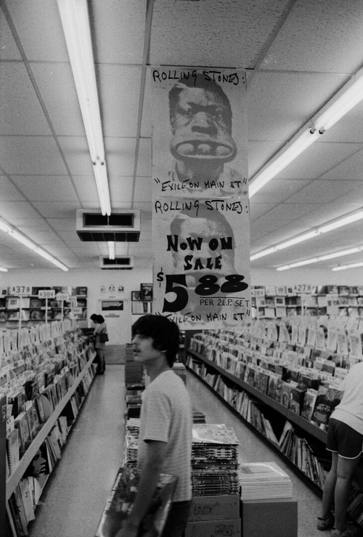
Perhaps the most memorable photograph on the cover is one of a guy holding three balls in his mouth. Marshall Chess, who was then the Stones’ manager, needed an image for billboards and other advertising; I had a great idea. ‘Look-it,’ he said, ‘Why don’t we take the guy with the balls in his mouth. That is the most amazing photograph I’ve ever seen. And doesn’t it look like Charlie?’
Keith was sitting on the couch across from me. He was looking at me in his mirrored sunglasses while smoking a joint. He looked so healthy, handsome, and rested. Then, to my surprise, Robert Frank (the photographer and filmmaker well known for his late 1950s book The Americans, with a foreword by Jack Kerouac) walked into the room with a small Super 8mm Canon camera. Jagger and I smiled. ‘This is a very hip day,’ I said to myself.
I knew Robert from a meeting in New York in 1968. I said to Jagger, ‘Hey, why not use Frank for the album cover?’ This was when the concept was launched in Jagger’s mind. Frank and Jagger had a conversation and later went off to seedy Main Street in L.A. to take photographs of the band, and this was when the Stones in ‘Exile’ and ‘Main Street’ came together as a title.
At the request of Marshall Chess, Norman and I came to a second day of meetings. We walked through the living room of the villa, down to the far wall in the dining room where Mick and Keith were waiting with Marshall. Marshall started the meeting, and Norman handed another album cover by another designer to him.
The cover was passed to Jagger for approval. He rejected it. Marshall then handed me a Robert Frank front photo collage. The tattoo-parlor-wall cover image was from Robert’s photo documentary The Americans. Mick, on my right, looked on for both of us to agree. This then became the famous photo-composition for the Exile on Main St. album cover. As the meeting progressed, the other pieces of the package were handed to me.
During the meeting, Marshall asked me what we would do with Norman’s photos, given that frank’s photos were the agreed-upon ones for the cover. Marshall had Norman’s images from the late-night photo shoot. They were the sequences in which Keith arrived at the very last minute for the shoot. Everyone had been waiting for him to show, and then he arrived with his pants hanging off his butt. With Keith’s arrival, the group was ready to go on with Norman’s session (‘This is a one-time shot!’ someone said). Lights, smoke, and confetti were readied, and a sequence was attempted, but then, by accident, Keith began to fall all over the set, creating a disaster. All else failed, and our budget had then been used up.
Suddenly Keith said from across the edge of the table, ‘Make some postcards,’ showing us with his hands an accordion-folded-style collection of postcards. He then proceeded to almost lose his balance and fall over onto the rug. I said to Mick, ‘Let’s take that as an idea and do it.’ He agreed, and Marshall said, ‘Done.’ Marshall and Jagger handed me a stack of photos made by Frank over the weekend. I left with the visual ingredients to go to my place at the Chapman Park Studio Building.
The last step of the approval process stopped at Ahmet Ertegun’s office at Atlantic Records. He was the label’s ultimate authority and so when this kind of art and aesthetic made it past his eyes, I knew that all would be OK. In the eyes of many in the industry, they were all shocked by the ugly, rough, tough, beat look of the package and that it was not funny or really humorous (to anyone but a Johnny Rotten).
So, as a result of Jagger and I sitting side by side in 1972 at our meeting, my arrangement of materials would go beyond Frank’s photo style, creating an identity that would become the basis of the punk fashion movement.
To the spectators, critics, and others in the establishment, I had made a package that was not glamorous. It was not a friendly image to put on display in the record stores, but it was that image that established the anti-establishment look of punk. It took years to recover from the cover’s graphic statement, with new generations of punks exploiting the graphic concept to this day - still ripping and tearing and drawing all over things with their own graffiti.
“The album cover art images from the past, as part of our culture, were styled for fashion and archetype.
In 1984, my friend John Lydon of PIL said to me, ‘The Stones’ Exile package set the image of punk in 1975 - we used that graphic feel to communicate our message graphically.’
In the 70s, I do feel that 12x12 album covers were an all-inclusive image of cultural style in the visual fashion of the sixties and the seventies. I was, therefore, a well-known designer of cultural images which were created as reflections of that culture. These were then watched closely by other design teams and designers who copied me their pursuit to find new images.
Today more than 100,000 artists are using a ‘Ripping and Tearing’ style and graffiti in their work. At least Johnny was nice enough to explain what his intention was then…
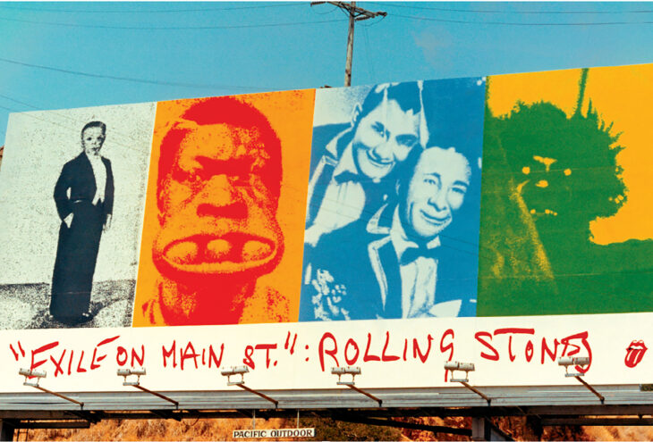
Q: There was also a huge billboard of your Stones’ Exile front cover on Sunset Blvd.
A: One day, Norman and I drove through Hollywood in his dark green ’69 Mustang convertible with the top down. I had a stat of the cover in my hand, and we looked it over as an art piece. I told him I thought if I were to take four of the front cover photos out and paste them in color into the billboard composition, I would have a great design.
So, I later blew up the photos and pasted them on a board. The next day I had to get the right measurements for the size of the hand-painted outdoor billboards. I went over to Pacific Outdoor to meet a couple of salesmen to show me a diagram of the billboard on the Sunset Strip. There in the office, we agreed and went over the government codes and restrictions for the scale requirements. I helped them maximize the size to be larger than normal. The finished product was finally was placed at Sunset and La Cienega, at the top of the hill. I focused the message around the fantasy, sideshow characters in the cover with the guy with eggs in his mouth.
(Harvey Kubernik is the author of 21 books, including 2009’s Canyon Of Dreams: The Magic And The Music Of Laurel Canyon, 2014’s Turn Up The Radio! Rock, Pop and Roll In Los Angeles 1956-1972, 2015's Every Body Knows: Leonard Cohen, 2016's Heart of Gold Neil Young and 2017's 1967: A Complete Rock Music History of the Summer of Love.
Sterling/Barnes and Noble in 2018 published Harvey and Kenneth Kubernik’s The Story Of The Band: From Big Pink To The Last Waltz. In 2021 they collaborated on Jimi Hendrix: Voodoo Child for Sterling/Barnes and Noble.
Otherworld Cottage Industries in 2020 published Harvey’s Docs That Rock, Music That Matters. His Screen Gems: (Pop Music Documentaries and Rock ‘n’ Roll TV Scenes) was published in 2026 by BearManor Media.
Harvey spoke at the special hearings in 2006 initiated by the Library of Congress held in Hollywood, California, discussing archiving practices and audiotape preservation.
In 2017, he appeared at the Rock & Roll Hall of Fame in Cleveland, Ohio, in its Distinguished Speakers Series and as a panelist discussing the forty-fifth anniversary of The Last Waltz at the Grammy Museum in Los Angeles in 2023. Kubernik attended the 1976 event celebrating The Band).
All posters courtesy of www.post-future.com (http://www.post-future.com)
Billboard photo by John Van Hamersveld
Jimi Hendrix, Buddy Miles photo by John Van Hamersveld 1968
Keith Richards, Sunset Sound Recording Studio, 1972
Tower Records Hollywood 1972 photo by John Van Hamersveld
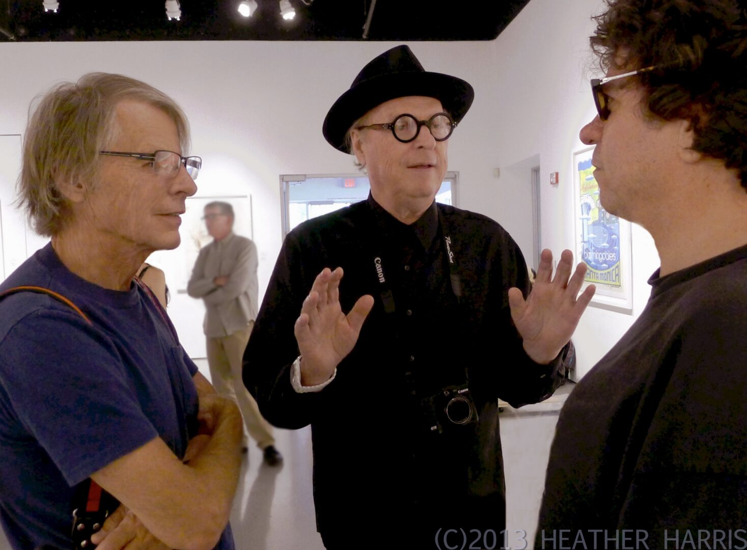
Kurt Ingham, aka Mr. Twister, John Van Hamersveld, Harvey Kubernik photo by Heather Harris